Brand Guidelines
Move Without Limits
Performance Podiatry exists at the intersection of clinical excellence and athletic ambition. We are not a typical medical clinic. We are a performance partner for anyone who wants to move better, recover faster, and push beyond what they thought possible.
Every element of this identity system conveys precision, expertise, and forward momentum. The visual language draws from both the world of premium sports performance and the precision of clinical science, creating a brand that feels authoritative yet approachable.
We combine deep clinical expertise with a genuine understanding of what it means to be active. Whether you're an elite athlete chasing a PB or someone who simply wants to walk without pain, we provide the insight and care to help you perform at your best.
To deliver world-class podiatric care that empowers every patient to move without limits.
To be Sydney's most trusted performance podiatry practice, known for clinical excellence and measurable outcomes.
Evidence-led care. Relentless improvement. Partnership with every patient. No shortcuts.
The logo pairs an elegant, high-contrast serif wordmark with clean sans-serif type to create a sophisticated yet clinical aesthetic. The deep teal dot serves as a signature brand element, representing precision and a focal point of care.
Maintain a minimum clear space around the logo equal to the height of the "p" in "performance." This ensures the mark always has room to breathe.
The palette is rooted in warmth and sophistication. Cream dominates as the primary background, with teal providing energy and a focal point. Stone offers subtle variation, and charcoal is reserved for essential text.
When composing layouts, aim for these approximate ratios to maintain brand consistency.
Charcoal text on cream. Primary combination for most content.
Charcoal text on stone. Use for alternate sections and cards.
White text on teal. Reserve for CTAs and highlight elements.
Typography is the backbone of this brand. Helvetica Neue provides timeless clarity, precision, and readability across all brand touchpoints.
Photography and visual content should feel natural, dynamic, and clinical without being sterile. Images should convey movement, precision, and real expertise in action.
Athletic
Movement
Clinical
Precision
Natural
Recovery
Dynamic
Energy
Biomechanical
Detail
Real
People
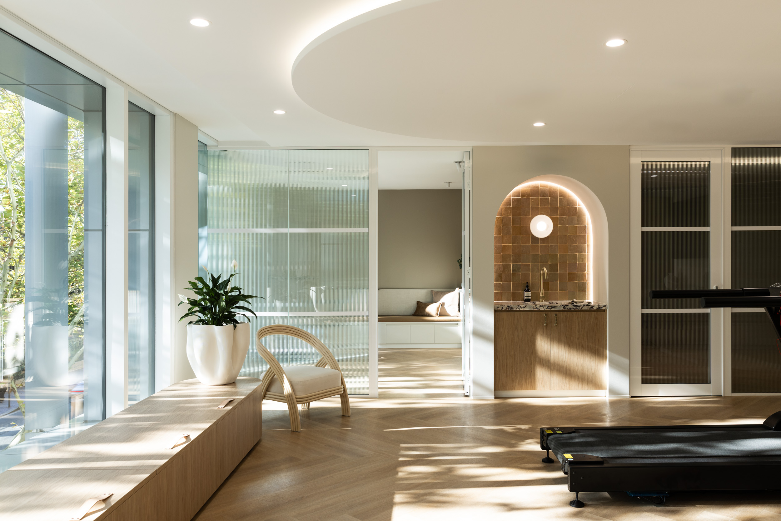
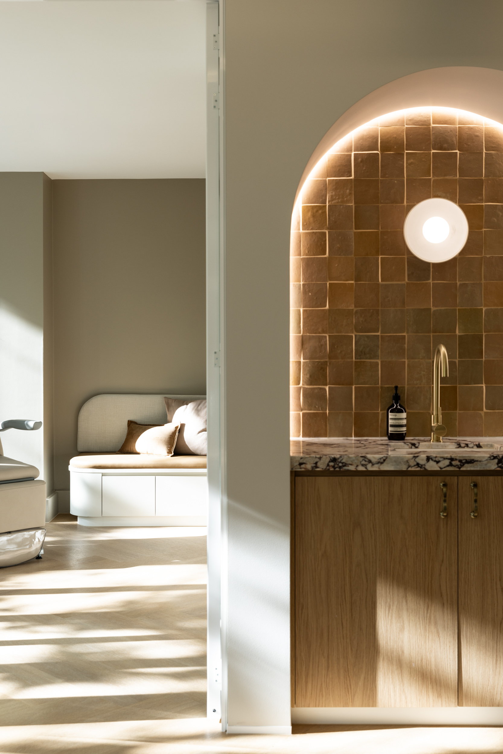
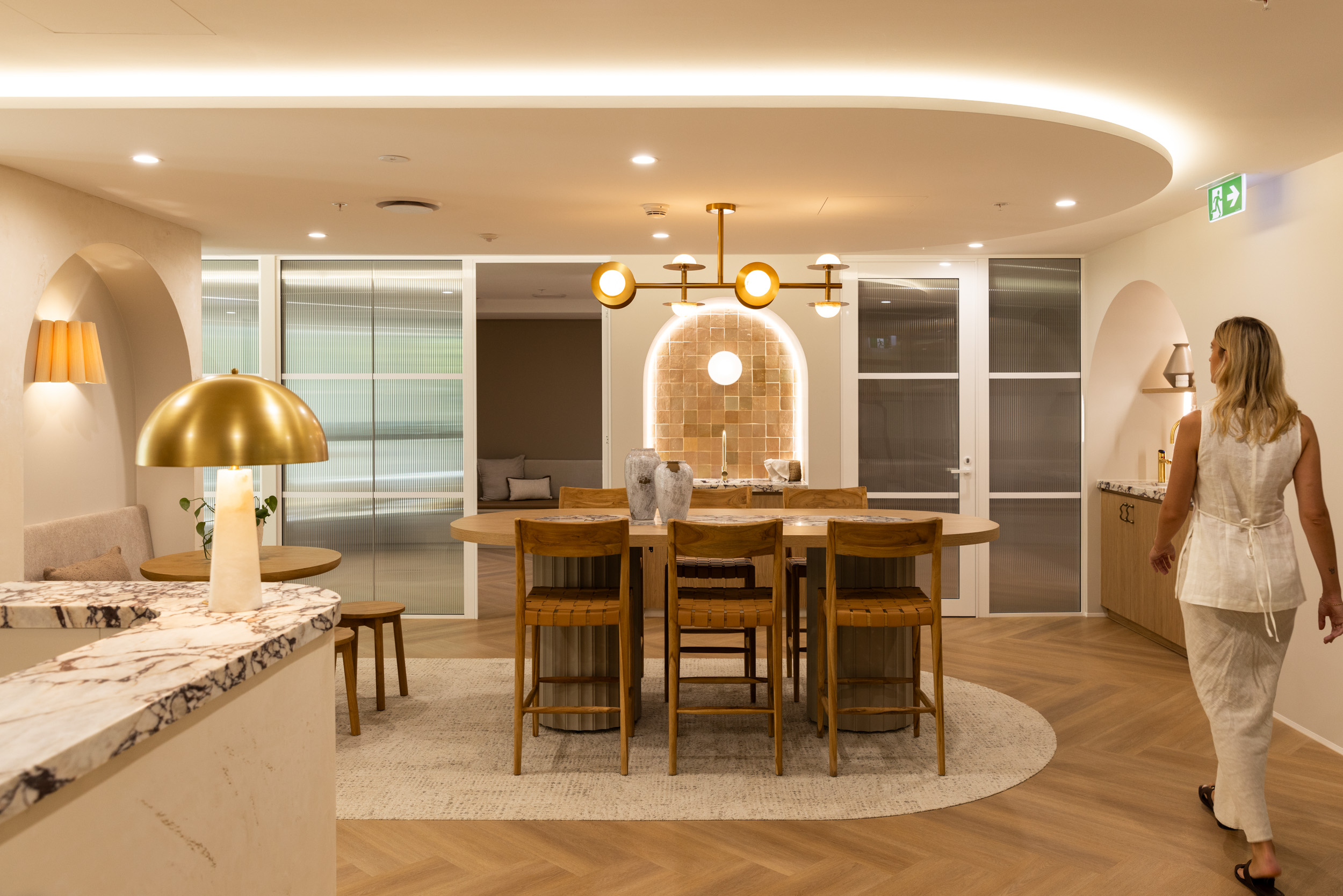
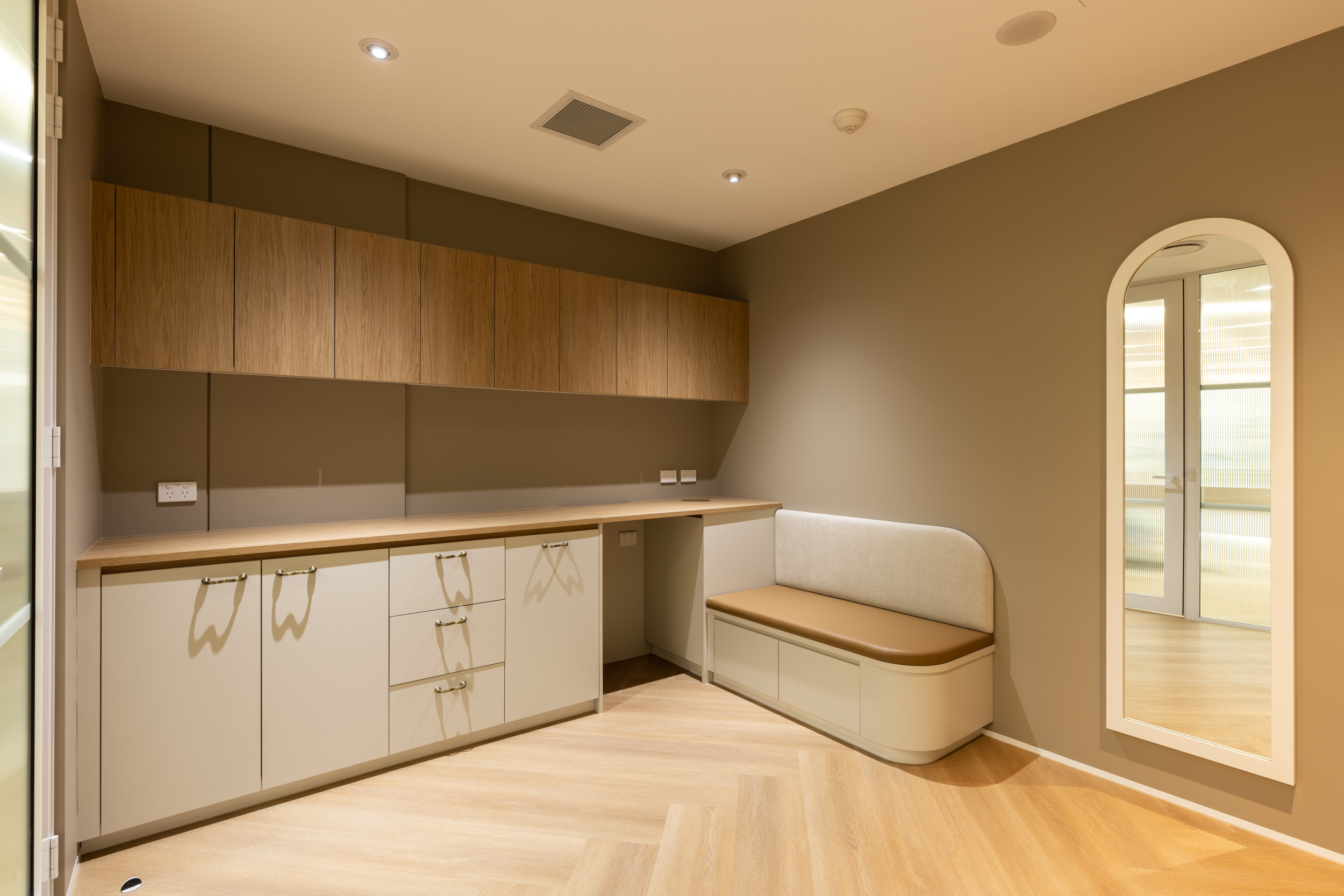
Real photography from the Performance Podiatry clinic — warm, architectural, and premium. These images set the visual standard for all brand materials.
Performance Podiatry communicates with authority and warmth. We are experts who make complex biomechanics accessible. We are confident without being arrogant, and caring without being soft.
"Your gait analysis reveals a pronation pattern that's contributing to your knee pain. Here's what we're going to do about it."
"It looks like your feet might be a little flat, which could maybe be causing some issues. Let's try a few things and see what happens!"
Consistent application of these guidelines ensures the brand remains cohesive and professional across all touchpoints.