Move Without Limits
Brand Identity — March 2026
01 — The Brief
Premium positioning. Build a brand identity that signals expertise, authority, and performance. This clinic isn't your average podiatrist — it's where athletes and active people go to get better.
Clean, not clinical. The brand should feel sophisticated and modern without veering into sterile medical territory. Think premium sports brand meets trusted health professional.
Masculine energy. Not gendered, but confident and strong. No pastels, no soft gradients, no playful illustrations. Direct, sharp, purposeful.
Differentiated. Stand apart from every other podiatry clinic with clip-art feet and teal colour schemes. This brand should feel like it belongs in a different category entirely.
02 — Research & Inspiration
JAEJA Podiatry
Minimal / Contemporary
Clean wordmark, muted palette, editorial layout. Closest to the premium tier we're targeting. Sets a baseline for sophistication but lacks athletic energy.
The Podiatry Project
Modern / Approachable
Bold colour blocking, geometric mark, strong digital presence. Good differentiation from the clinical norm. Leans lifestyle over performance.
Industry Standard
Clinical / Generic
Teal/green palettes, foot iconography, stock imagery. This is the default look for 90% of podiatry clinics. The template we're designing against.
"There's a wide-open gap in podiatry branding for a clinic that looks and feels like a premium performance brand rather than a medical practice."
03 — Brand Strategy
To deliver elite-level podiatric care that helps every patient move better, perform better, and live without limits. Expert treatment, backed by science, built around you.
To be the go-to podiatry destination for athletes and active individuals who refuse to let foot and lower limb issues slow them down.
Performance-driven. Evidence-based. Patient-centred. No shortcuts. We treat the person, not just the symptom, with the rigour and precision of a high-performance environment.
Performance Podiatry sits at the intersection of clinical expertise and elite sport. Not a GP referral afterthought — a first-choice destination for people who take movement seriously.
04 — Target Audience
22 – 38 • Club to elite level
Runners, footballers, triathletes. They train hard, race often, and need a podiatrist who understands load management, biomechanics, and getting back to competition fast. They want expertise, not hand-holding.
30 – 55 • Health-conscious
Gym-goers, weekend warriors, CrossFitters. They're invested in their health, willing to pay for quality, and research their providers. They want a clinic that matches their own standards — professional, modern, no-nonsense.
35 – 65 • Referred by allied health
Sent by physios, GPs, or sports doctors. They trust the referral but assess the clinic on first impression. A premium brand signals competence and justifies the recommendation before they walk through the door.
05 — Your Brand Identity
A brand built at the intersection of clinical authority and athletic ambition. The logo is a clean serif wordmark — calm, refined, and unmistakably Performance Podiatry.
05a — Primary Logo
The primary logo is a clean serif wordmark. On light backgrounds, the teal text creates authority. On dark backgrounds, the white variant maintains the same impact.
05b — Logo System
06 — Colour Palette
Cream
#F5F0E8
Primary background. Warm, inviting, never sterile.
Warm Charcoal
#2C2C2C
Primary text and dark backgrounds. Authority without harshness.
Deep Teal
#046760
Brand accent. Confidence, depth, the signature dot.
Light Stone
#E8E0D4
Subtle dividers, cards, secondary backgrounds.
A warm, earthy palette that feels premium without being cold. The deep teal is the only high-saturation colour — used sparingly, it draws the eye exactly where it matters.
07 — Typography
Used for: headings, the logo wordmark, pull quotes, and any moment the brand needs to feel elevated and editorial.
08 — Brand Applications
Charcoal stock, warm cream and teal accents. The card itself becomes a brand touchpoint.
Clean, minimal layout with subtle brand line. Professional correspondence elevated.
Templated tiles across the palette. Consistent, recognisable, scroll-stopping.
Dark fascia with illuminated logo. Premium street presence that signals quality before the patient enters.
09 — Photography Direction
Capture athletes mid-stride, mid-treatment, mid-recovery. Never static or posed. The brand is about action and momentum.
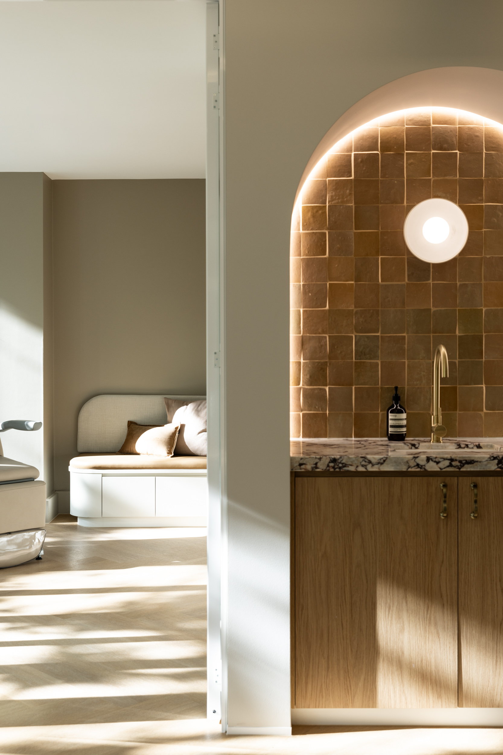
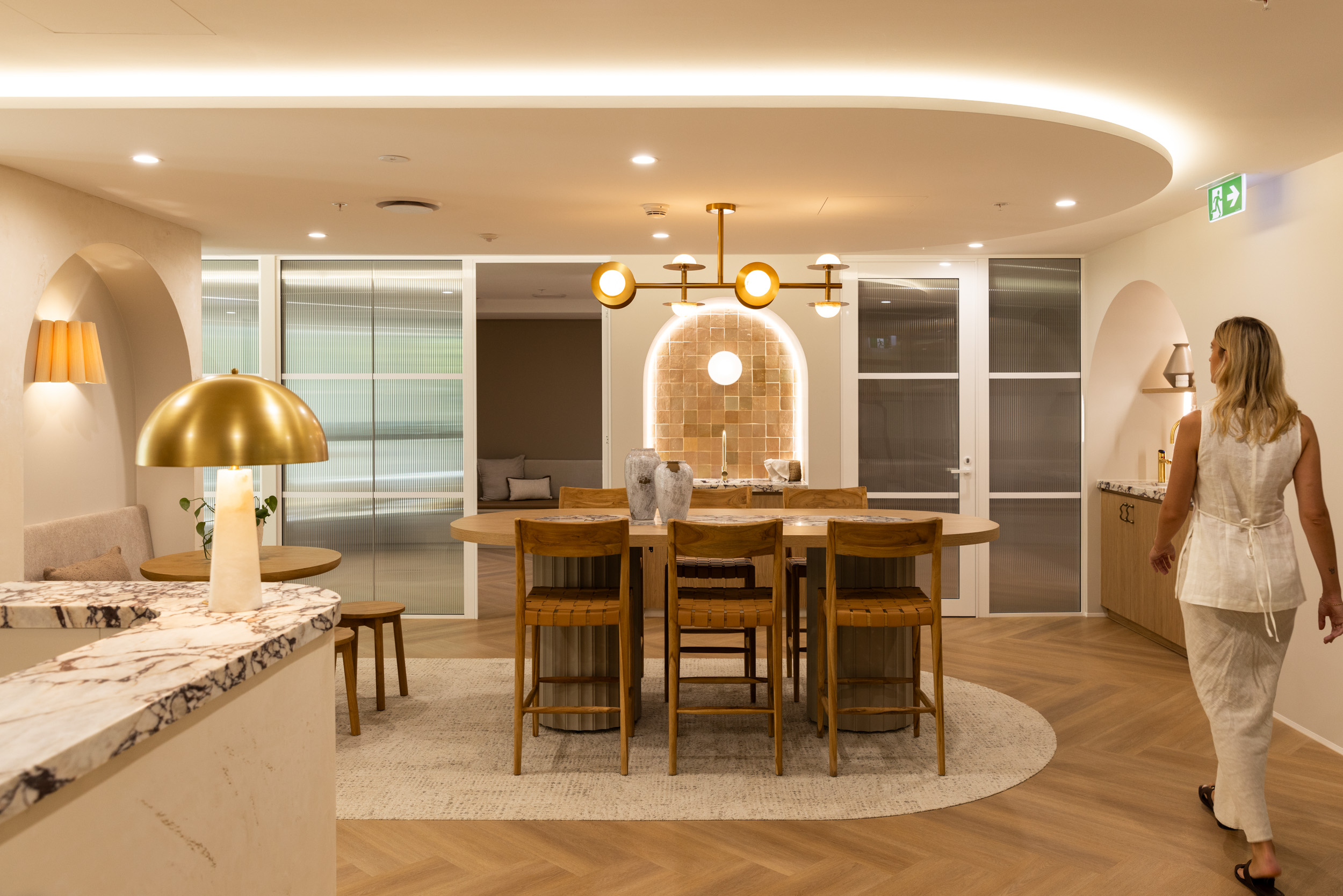
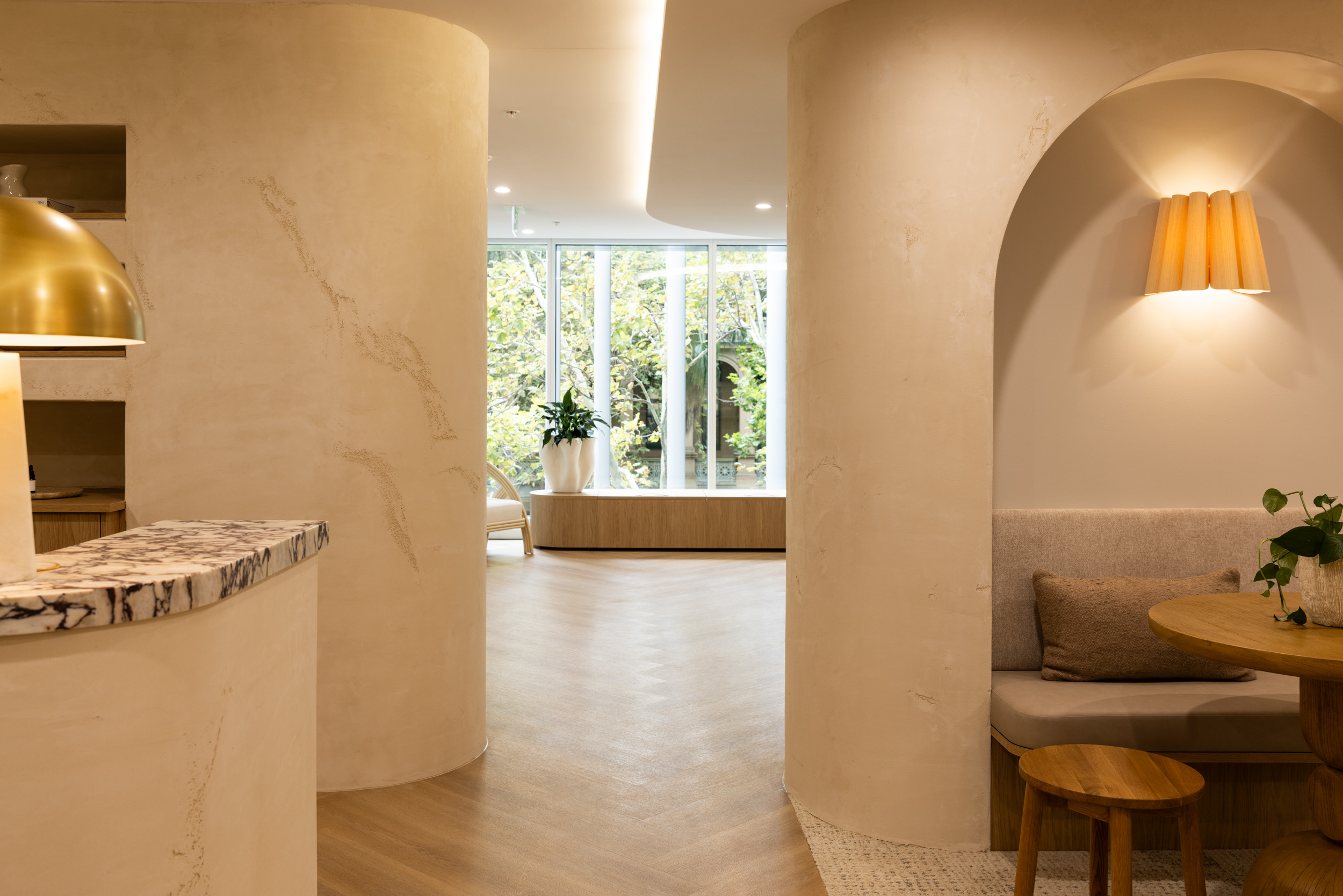
Desaturated, warm-graded imagery. Match the brand palette — creams, warm shadows, natural light. Never clinical fluorescent lighting.
Close-up shots of hands at work, custom orthotics, biomechanical assessments. Showcase the craft, the science, the expertise behind the brand.
No stock photography. Real athletes, real patients, real clinic environments. Authenticity builds trust faster than anything else.


"Photography should feel like you're looking at a premium sports brand — not a medical brochure."
Move Without Limits.
We're excited to bring this brand to life.
Let's build something exceptional.